***Please refer to the figures in the previous post below as I mention them over the course of the paper. They are all labeled.***
Dan Barlekamp
Professor Mizenko
EAS299: Visual Culture of Japan
14 May 2009
Thunder in the East:
A Visual Study of Popular 1980s Music in Japan
Music, and mainstream popular music in particular, is far from a solely auditory social force. In fact, I would argue that up to 50% of popular music’s effect on society depends on its visual component. Records released by major labels or by independent artists hoping to find their way into the mainstream are very carefully packaged in order to achieve the greatest impact possible on the wider audience. Glossy pop vocalists, loud rock groups, and solo instrumentalists looking to make a living off of their musical career all have one goal in common: the highest possible record sales. And it does not just take good music to achieve this. It also requires an image, a visual that will grab the audience and stick with them, encouraging them to buy the records. Thus, the image needs to be unique and striking, and both artists and their marketers work hard to establish it.
The youth is particularly important here, especially the adolescent subpopulation. They are, and have always been, the widest audience and the most important factor in popular music sales. That being said, most contemporary and emerging artists who are looking for the highest level of success will target this portion of the audience specifically.
This is also where the highest level of divergence occurs among the musicians and the style of imagery they choose to adopt. First of all, their target gender and age group may differ. For instance, one female pop vocalist may be marketing her work towards younger, preteen girls. As a result, she may choose to dress in cute parent- and child-friendly clothing, use innocent, feel-good lyrics, and employ simple, upbeat and catchy melodies. A raunchier rock band, in contrast, may want to gear their music towards adolescent boys. Accordingly, they may adopt battered, dirty denim outfits and long, greasy hair, spout off aggressive, sexually driven lyrics, and musically rely more on sheer volume and power.
The lines are not always as clear-cut as this, however. The other major concept to keep in mind about this sort of well-strategized imagery is that it is meant to invoke a very particular emotional response, whether it is a conscious or subconscious reaction. That is, each of these artists has a very definite and well-considered set of emotions in mind that they attempt to appeal to. For example, a rapper may wish to connect with a teenager’s frustration with living in poverty, and in turn his or her feeling of alienation as a result of it. To do so, the artist may don tattered, baggy clothes often associated with the ghetto and write words that deal with the hardships of the poor life. In another scenario, a rock group different from the one imagined above may attempt to sell records by appealing to an audience of sexually repressed teenage girls. To attract these listeners, they may dress in tight-fitting, revealing leather clothing, and strike provocative poses in their photographs that suggest male aggression and dominance. They may rely more on this flashy, confrontational imagery than on their music, boasting sexually-charged and male dominant lyrics intending to excite a frustrated, female teenage audience.
Mainstream music cannot be underestimated as a societal force. Ever since the earliest days of modern recording and the beginnings of music marketing and packaging, it has been one of the most popular cultural phenomena. Music has an uncanny ability to influence people’s thought patterns and actions. The evidence is everywhere around us; it has simply taken on various shapes and forms over the decades. Think about it: in the 1950s, Elvis Presley and countless other rock ‘n’ roll artists drove young girls wild with romantic passion, outraging parents all across America. In the late 1980s and early 1990s, out-of-control Scandinavian metal bands unleashed a string of church burnings, arsons, and murders committed by angry teenagers that was inextinguishable for nearly a decade. In the early to mid 1990s, Nirvana and innumerable copycat groups caused a fad literally defined by laziness and poor hygiene habits. And although every time the angry parents never fail to rally and complain, it always works in the musicians’ favor; it only serves to gain them more public attention. Regardless of whether each movement was healthy or harmful, the record labels snapped them up greedily. The bands’ images, and the ways in which they were presenting themselves to the public, were garnering significant attention and having a profound effect on large portions of youths. And it was all due mainly to the visual sides of the artists and how they asserted themselves onto their listeners.
I have found that in the West, when people think of the 1980s, what they generally envision is the North American and British popular music scene, and the various fashions that followed. They immediately laugh and recount that “bad” or “embarrassing” time in our cultural history, picturing all-male rock bands dressed as women, high school football players sporting mullets, and teenage girls with unfathomably large hairdos. Sure, this is all amusing (albeit over-generalized), but what was happening in the rest of the world? Why do we tend to ignore the East when thinking about this time period? As Westerners, we seem largely unfamiliar with the 1980s culture of the east. As a fan of the Western 1980s and its music, I decided that it would be interesting for me to do a brief visual culture study of the popular music and related imagery of 1980s Japan, if only to broaden my horizons and discover what was happening with music on the other side of the world. Specifically, in the following essay I will examine the music and its visual counterpart in relation to technological and economical standing at the time; the movement of “Visual Kei” which swept the nation in the latter half of the 1980s; the inclusion of traditional Japanese instruments and visuals into the sound and imagery of popular music; and the relationship between Japanese musicians and similar-looking Western musicians.
Around the late 1970s and early 1980s, Japan’s economy began to gradually improve, leaving it in a more than encouraging position by the close of the decade [data source: Ministry of Internal Affairs and Communications, http://www.excite-webtl.jp]. Also, prior to the 1970s, Japan relied heavily on foreign research. The 1970s and 1980s, however, saw Japan becoming much more independent and sinking exponentially more money into its own domestic research and development programs. Naturally, this is when Japanese technological innovation skyrocketed, and accordingly when foreign eyes shifted onto Japan and its scientific advances [data source: Country Studies, http://countrystudies.us/japan/105.htm]. Although there is no way of proving that these two factors are directly related, it seems fairly obvious to me that the former had a very definite impact on the latter. With a drastically improving economy, the nation of Japan found itself significantly more financially stable, and could afford more opportunities to perform its own experiments.
It comes as no surprise, then, that this led to a national fascination with the technology that was rapidly being developed. It must have been an exciting time: Japan was finally able to stand on its own two feet and sever the ties it had to other nations for support, responding to their latest inventions and discoveries with its own. This can be seen through several different media. Perhaps most famously to us here in the West, the vast majority of arcade machines and home video games that were selling in North America were created in Japan (and still are). It is also, however, strongly reflected in Japan’s popular music scene at the time. The early 1980s saw the emergence of a new genre of pop music in Japan, that of new wave music and synthpop. The evidence of technological fascination comes shows through in two aspects: both through the music itself, and through the imagery produced in music videos and band photographs.
Musically, new wave and synthpop are a strange blend of punk rock and early rock ‘n’ roll, fused together with a heavy dose of techno, electronica, and/or dance music. This last aspect is its defining characteristic, as well as its most revealing. Prior to this time, electronics were left nearly entirely out of punk and rock ‘n’ roll music. In fact, many artists verbally abused it, affiliating it with the enemy disco music scene. New wave and synthpop, however, emerged as a rebellion against all forms of popular music. And while they are most often attributed to the West, most notably Britain, these two genres gained a substantial following in Japan also, spawning many bands. Referred to as “technopop” in Japan, the movement saw bands such as The Yellow Magic Orchestra (YMO), The Plastics, and Hikashu climb to the top of the charts. These bands took their punk and traditional rock ‘n’ roll roots and injected them with dancy, oftentimes overdone electronic effects that feel very much like the sound effects from a video game of the same era. The result is an arresting, eclectic sound that unashamedly reflects the obsession with technology that gripped the nation at the time. The overuse of said effects suggests that much of the population simply could not resist this sudden surge in Japanese cultural independence and technological progression that came on so suddenly and helped identify Japan as an autonomous power.
More important, however, and perhaps even more striking, is the images that these technopop bands presented, both in their music videos and in their still photographs. I will begin with the videos. Overall, most of them tended to utilize then-modern graphics and animation that caused them to play very much like video games. Instead of watching the band members in live action, the audience would see their figures being animated and moved about the screen almost like cartoon characters, performing strange robotic dances or being launched and twirled about the screen. Of course, it all looked very cheesy and unrealistic, but I believe this was part of the point: To keep the audience consistently aware that what they were watching was the product of Japan’s newfound talent for computer animation. The backgrounds and settings of the videos themselves also became drastically less realistic. Instead, they quickly became very outlandish and far more fantasy-driven than the comparably simple, low-budget, often awkward music videos that bands originally began to churn out in the 1970s [figure 1, video link: Black Sabbath, “Paranoid”]. Most Japanese technopop bands completely rejected live sets altogether, opting instead for videos shot entirely in front of a blue screen. This opened up a whole new world of possibilities for them. Instead of performing in front of one stagnant, unmoving background, they were now playing in psychedelically colored, interactive worlds. They were underwater, flying through outer space, and in some cases actually set inside of fully operational scenes from a video game (figure 2, video link: YMO, “Computer Games”). And it is my opinion that the people who created and marketed these videos chose this route for this reason: simply because they could, and because it was making them massive amounts of money. These music videos were rapidly becoming less about the songs themselves and more about showing off the quickly-progressing Japanese technological machine. As stated above, it really helped push Japan towards becoming a much more self-sufficient nation, and as such a lot of domestic interest and pride grew from these technological advances. And these types of music videos really appealed to this mass emotion. They unashamedly showed off these advances with pride, and I think it would make sense that the Japanese public would enjoy watching them as a reminder of their nation’s recent accomplishment.
Next, I would like to take a brief look (if such a thing is possible here) at the movement known as “Visual Kei” that began in Japan in the 1980s. As a disclaimer, this is not a paper on Visual Kei, and as such I will not be going into too much detail with regards to history and technicalities such as that. Instead, I will try to visually analyze what I have found.
Visual Kei, by definition, is a style of dress used by Japanese musicians that first saw life in the early 1980s. It is characterized by unusual makeup use, eclectic, glitzy clothing and large, wild hairstyling. When being described, it is also often linked to cross dressing, as gender lines tend to blur often (figure 3). Visual Kei is not linked to one specific genre of music. Technopop groups, heavy metal bands, and every other sort of artist in between were equally likely to adopt this style, and thus Visual Kei cannot be used to identify a particular type of music. Its roots are in the Western glam rock movement of the 1970s (figure 4), which was also defined by a kind of cross dressing, though was admittedly far less outrageous. It is often compared to the style of Western glam/hair metal musicians that were dominating the charts in America at the same exact time, and this comparison will be addressed later on. Visual Kei reportedly fizzled out as a movement by the arrival of the early 1990s (as did the Western hard rock acts that were popular at the time), although many fans will argue that it never really went away, and that it simply left the spotlight for awhile. Around 2007, the movement supposedly made a comeback into the mainstream, although I am not sure of the validity of this statement.
As I first began my research on the Visual Kei movement, the question that immediately popped into my head was: “why?” The primary reason for my being perplexed was that the image does not seem to make sense with the music and lyrical content, which to me was the most striking aspect of the whole thing. The tricky thing about the Visual Kei artists, however, is that they cover such a wide variety of musical styles that there are a huge number of lyrical themes and band messages. For example, the technopop bands above, their image, music, and lyrics all reflected the understandable social phenomenon that was happening as a result of Japan’s economic and technological innovations. Also, the pop-rock band Buck-Tick (who also change genres very frequently) most often sing songs of love and life. And on the extreme end of the spectrum, hard rock/heavy metal bands Loudness and X Japan have lyrics about women, sex, partying, beer and rock ‘n’ roll, and are actually not far removed from what the Western bands were singing about. And yet despite such glaring musical and poetic differences, Buck-Tick, Loudness, and X Japan look strikingly similar in their band photographs; one would think that they all played the same style of music (figure 5). And none of their lyrics address or hint at any desire to dress like women or really defy society’s “normal” manner of dress in any way. This is why it is so much more difficult for me as a Westerner to deal with the Japanese bands than it is to look at their Western counterparts, who I find are much more obvious in their motives. This is why all I can offer are my own observations and speculations.
I have three theories when it comes to the motives behind why these musicians chose to dress as they did. The first deals with sexuality, and what specific audience they were gearing their music toward. Seeing as many of these Visual Kei bands were very popular and continually topped the charts over the course of the decade, I must assume that their fan base consisted mainly of younger people. That being said, it has always been very common for mainstream, male-run pop and rock acts, regardless of nationality, to present themselves in such a manner that would make them physically attractive to their youthful female audience. It is an old tactic not only for increasing the public attention they receive, but also of selling more concert tickets as well as records. Popular bands would not dress themselves up in such a way that would be a turnoff for their audience. Therefore, since this Visual Kei style was so popular amongst artists, and since it was so long-lastingly popular, I think it is very likely that the adolescent female listeners were in some way sexually attracted by the men in the bands who were dressing this way.
There are also several hints that point to this. First of all, although the band men did indeed dress in lavish costumes, this did not prevent them from striving for something erotic. Revealingly tight leather pants and open shirts were very common (figure 6). To further this idea, in many music videos, especially those from late 80s rock acts; the band members would spend a great deal of the time dancing and throwing seductive looks at the camera (the camera all the while utilizing perfect, close-up angles). Clearly there were sexual messages being sent to the female audience here. And the lyrics only help to support this proposal. With song titles such as “Tears for the Lovers” (Anthem), “Love Bites (Virus), and “Killing in the Romance,” (Paranoia), it is clear who the bands were addressing in the lyrics. They certainly did not try to hide this, either. The poetry of Loudness asks a woman to “Look back sexy woman/Sure you can’t see anything/Kiss me baby please/Feel me right now!!!” The vocalist here is fairly straightforward about what he is after. And for my final piece of evidence, when I received X Japan’s 1988 record in the mail, I knew right away where it was headed (figure 7).
The majority of the song titles dealing with love that I have come across so far, like those listed above, nearly all deal with aggressive, even violent, male-dominated “love.” There are very few of the sentimental, puppy-love ballads that would make for platinum singles for the American hard rock bands of the time. This leads me to believe that specifically, the Visual Kei bands were targeting the sexually frustrated and rebellious emotions that many youths experience in their teenage years.
My second theory for the motives behind Visual Kei is far simpler than my first. It deals with rebellion. It is possible that I have been overcomplicating the whole ordeal, and that the whole of this style was a simple attempt at rebellion against “normal,” everyday society. It would not be the first time a popular fashion statement had its roots in such a goal. Punk rockers in 1970s Britain, for example, did just about everything they could to stand out from the status quo and repulse the day-by-day “slaves to the grind” that threw them dirty looks. They loved it, and it defined their genre. It still does, to some extent. Therefore, Visual Kei could very well share a similar goal.
As stated above, American hard rock bands that were rapidly becoming extremely popular at the time had a style very similar to Visual Kei. Often, band members would dress like women, perm their hair, apply makeup, lip-gloss and nail polish, and prance around a stage lit with bright pink lights in their high-heeled cowboy boots. Bands such as Poison, Cinderella, and Britney Fox climbed to the top of the charts almost effortlessly, being signed to huge labels such as MCA and Capitol due mainly to their image (figure 8). Music videos were made for more songs than they should have been, and teenage girls were fainting left and right. That being said, I think possible that the Japanese bands saw the success this whole thing was garnering for the Americans, and tried to imitate it in their own way, complete with the big hair, makeup, etc. I do not, however, believe that this was really the case.
The Japanese bands “outdid” the Americans in every sense of the word. Their hair was bigger, their makeup was thicker, and their image was all around more striking. I do not think it is too far-fetched to argue that perhaps in trying to mimic the success of the American bands, the Japanese ended up challenging them. After all, as the 1980s rolled on, more and more Japanese bands were trying to force themselves into the American market. By 1985, for instance, Loudness had been signed to MCA Records, a predominantly American label, and had shoved several Americans off of the charts with their single “Crazy Nights.” Although there is no way to prove this motive for sure, I think that it is certainly a legitimate thing to consider.
Before moving on from the topic of Visual Kei, there is one more possibility that I would like to consider. Although this is largely unchartered territory for me and I am not very familiar with the subject, I think that the influence of Japanese animation must have had a profound influence on the Visual Kei artists. At the risk of sounding like a fool, I went back and watched clips from older Anime shows that date back before 1985. Again, please remember that I am no expert, but I did find a bit of a connection between some of the characters in those shows and the music artists themselves. For example, the large, almost futuristically styled hair was not uncommon in the shows. Also, the costumes that I found several of the heroes and villains wearing in the cartoons were strikingly similar to the outfits worn by more outrageous Visual Kei bands, such as Girl Tique and Aion (figure 9). It is a possible theory, then, that the Visual Kei bands were attempting to mimic the style of dress found in popular Anime, either as a way to express their love for the cartoons, or even as a way to attract more fans; that is, perhaps teenagers who would not otherwise listen to the bands’ music, but choose to pick up some record because the band men resemble characters from their favorite Anime.
In the interest of space, I will move on to my next and final topic. I would like to examine the inclusion of “traditional” Japanese imagery in the visual aspect of popular Japanese 80s music. It was not at all an uncommon phenomenon, with examples sprouting up all over the place and across several genres. It is, however, much more common on the rock side of the spectrum since, as discussed above, the pop and technopop artists were more concerned with modern technological advancements, the opposite of old cultural traditions. Regardless, the album covers and sleeve inserts of many bands were dominated by classic Japanese paintings and other pieces of art, as well as flags, etc. I have come across at least five band photos that depicted the group in question posing in front of The Great Wave off Kanagawa. Even more common is to find the occasional band member dressed in a kimono. What I am going to speculate about is: Why? Why would a mainstream rock act, concerned with being modern and popular, seducing their female audience, and even entering the American market, want to be seen in front of an old, traditional Japanese image? And what made some Japanese rock stars trade their leather chaps in for a kimono? It seems almost like a paradox (note: I will use a Loudness album cover and a band shot of Virus as my two primary examples in this section. They are figure 10 at the bottom of the document).
I have two theories. The first is that this tactic may reveal some kind of nationalistic nostalgia among the artists, but that it was mainly a marketing tactic. The front cover of Loudness’s 1985 effort, “Thunder in the East,” is what initially sparked this idea for me. I have had this album for some time, but it did not strike me until a few months ago that the cover of this album features the war flag of the Imperial Japanese army, used during World War II. I find this to be an odd choice for an album cover, as it does not match any of the themes found in the music itself. With tracks such as “Crazy Nights,” “Like Hell,” and “We Could be Together,” it is obvious that none of their lyrics actually focus on any sort of Japanese pride or history. Also, the title of the album, “Thunder in the East,” boasts a lot of national pride. The strangest part is that this was Loudness’s breakthrough record. With this one, they really broke through in America, earning themselves an impressive spot on the charts where they would remain for the rest of the decade. None of their previous albums feature this kind of Japanese pride in the packaging. So, why did they include it on this one, the album with which they hoped to spread their music to the other side of the world? It seems to make perfect sense. Before, their records were only selling in Japan. It would seem kind of silly and obvious to be boasting Japanese pride there, only amongst their fellow countrymen. But now that they had a wider audience and the full attention of other nations, perhaps they chose to break out and let the flag fly free. If anything, such imagery would be “different,” and would separate them from the hordes of Western bands. The fact that they chose a flag that might prove controversial in America (due to the common national consciousness of the attacks on Pearl Harbor) supports this idea. Sure, it could have been done as a way to rub Japanese pride in the face of an American audience, but more likely, it was probably meant as an attention-grabber for the media.
The same can be said for the Japanese band Virus. In many of their photographs, one or more of the members is wearing a kimono or some other type of traditional garb. Note in Figure 10 below that the member on our far left also has his hair up in a more traditional bun, instead of wild and all over the place like the other guys. The band was formed in the late 80s, when many other bands like them were beginning to try to tap into American markets (the latter half of the 80s saw this type of music truly taking hold in the United States). All of their lyrics were in English (such as it is), which reveals just who their intended audience was. One would imagine, then, that they would try to conform and copy the image of the American bands that they were trying to get in with. But instead, they opted for their own unique, traditional (or stereotypical?) “Japanese” style, again probably as a way to get noticed. Regardless of whether or not it worked (for Virus, it sadly did not, they dissolved rather quickly), it seems like a logical and unsurprising marketing tactic. Of course, it is possible that they wore the kimono out of nostalgia, to indicate a desire to return to the “glory days” of Japan. But it seems more realistic to me that this was purely a business move, if only because rock band photos for popular magazines does not seem like the appropriate domain for the praise of ancient cultural traditions.
My second theory is less complicated and is very similar to the idea that the Visual Kei bands may have used traditional Japanese imagery in order to garner attention. I think it is possible that Loudness may have reprinted the flag of the Japanese Imperial army, and that many band members chose to wear a kimono simply to be ironic. This is not difficult to imagine; we see things like this all around us in America every day. The fact that you can walk into a teenage clothing store and buy a tie-dye Grateful Dead shirt, or that you see 13-year-olds walking down the street with pre-faded AC/DC t-shirts proves this. How many real, 15 year old Grateful Dead fans are there? Probably not many. But throwback 60s and 70s clothing has some mainstream appeal to it because it’s ironic. And why does a boy born in 1996 want an AC/DC t-shirt that was purposely made to look like it was bought in 1980? For the same reason: it looks like it was pulled right out of a time warp, and this attracts more attention than a fresh, crisp new t-shirt. Therefore, I think that these Japanese bands chose to take on these images not because they wanted a return of the Imperial army or because they took pride in walking around in a kimono each day, but because it helped them to carve out their own niche. It gave them their own unique image that would immediately establish them as a purely Japanese band, and not just another Western rock band spinoff (although that’s exactly what many of them ended up sounding like). And again, this might indicate a level of national pride, but I am still of the opinion that it was more of a marketing gimmick than anything else. Each new genre and each new generation needs a new look to make itself different from previous ones, otherwise they’ll simply be labeled as recycled material and will not last. I believe that this is the foundation of the use of traditional imagery and clothing in the bands’ visuals.
Once again, I am far from an expert on Japanese history and culture. I know that there is at least one other project being done on Visual Kei, and that I most likely have barely scratched the surface with regards to details, cultural significance, and the like. These are, however, the observations that I have been able to come up with. And I think that for the most part, they make sense: the sudden rise of technopop and its musical fascination with technology at the time of Japan’s economic rise bears a logical connection. However, when it comes to the Visual Kei bands, their unique style of dress, and their use of traditional imagery and outfits in their visuals, I believe that although they certainly look different from the bands that we had here in America at the time, they are actually strikingly similar. Both the Western and Japanese bands were doing something new at the time. They were trying to look different, and to shock the media as a way of garnering attention and popularity. And they did it in ways that strangely paralleled one another. They all sang typical dirty, “tough guy” lyrics, but dressed exactly the opposite: as women, and as outrageously and ridiculously as possible. And to be honest, absurd and “embarrassing” as some may claim it to have been, it worked. X Japan still retains a healthy fan base, and Poison’s 1988 megahit “Every Rose has its Thorn” still enjoys regular radio play. And in the end, although their tactics may have been somewhat different, both the Americans and Japanese were the same in one aspect: they were all essentially pop musicians, doing what they needed to in order to gain a career and sell records. So no matter what nation or side of the globe a person hails from, certain things always remain the same; and I hope I have provided a useful visual analysis of the imagery and history that I have researched.
Word Count: 5,416 (with the photos and captions).
Thursday, May 14, 2009
Figures for Final Paper
***Please refer to these figures as they are mentioned in the paper. All photos are borrowed, and are the property of their respective owners.***
-Figure 1: Video : Black Sabbath, “Paranoid,” 1970: http://www.youtube.com/watch?v=1jdAwXV7eVM
-Figure 2 : Video : YMO, “Computer Games” http://www.youtube.com/watch?v=aHhYbVVDuoA
-Figure 3 : Example of blurred gender lines in Visual Kei (http://theanimeblog.com/wp-content/uploads/2006/11/visual-kei.jpg). These are all men.

-Figure 4 : 70s glam rock was an influence on Visual Kei artists. Alice Cooper (top, http://img361.imageshack.us) and T. Rex (bottom, grumpyrabbit.co.uk)


-Figure 5 : Compare the similar images of pop/rock act Malice Mizer (top, image from Wikipedia.org) and speed metal group X Japan (bottom, metal-archives.com)


-Figure 6 : Loudness (http://1.bp.blogspot.com/)

-Figure 7 : Tell-tale cover of X Japan’s 1988 debut record, “Vanishing Vision” (metal-archives.com).

-Figure 8 : American rockers Britny Fox (top, http://www.freewebs.com) and Cinderella (bottom, http://media.photobucket.com) are not too different from their Japanese rivals.


-Figure 9: Girl Tique (top, metal-archives.com) and Aion (bottom, metal-archives.com) wear costumes reminiscent of Anime or Japanese video games. “Aion” is actually also the name of a game.


Wednesday, April 22, 2009
Final Presentation Outline
I will be doing my final presentation on the imagery of popular Japanese music in the 1980s and its relation to what was occurring socially and economically at the time. I will not be focusing on one genre in particular, but instead will jump back and forth between genres. Through research I found that many of these genres were very much interconnected, and also that each had its own unique insight to offer into various aspects of society through its visuals. The four main subjects that I will be looking at are:

3.) The inclusion of traditional Japanese instruments in songs, as well as "traditional" (or stereotypical) Japanese imagery on album covers, in band photos, etc. Does this reveal nostalgia for Japan's "glory days?"

4.) I was also thinking about comparing this Visual Kei imagery with what was happening with American bands at the same time. The imagery was similar... were the Japanese influenced by the American groups, or vice-versa, if they paid any attention to one another at all? Also, Japanese bands and American bands that looked similar had very different explanations/motives for why they chose to dress as they did. Despite the similarities, they were actually quite removed from one another.

1.) 1980s pop/new-wave music and its relation to Japanese technological innovation at the time (which was due largely to an expanding economy).
2.) The movement of "Visual Kei," which grew substantially in popularity in the second half of the 1980s and enjoyed a revitalization in 2007. What is its relation to the gender roles conceptualized at the time? And why the sudden revival?
4.) I was also thinking about comparing this Visual Kei imagery with what was happening with American bands at the same time. The imagery was similar... were the Japanese influenced by the American groups, or vice-versa, if they paid any attention to one another at all? Also, Japanese bands and American bands that looked similar had very different explanations/motives for why they chose to dress as they did. Despite the similarities, they were actually quite removed from one another.
Friday, March 27, 2009
"Cute" Blog Assignment
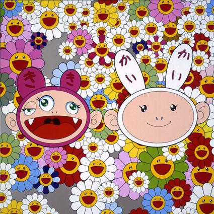
Ok, I've got two images to offer up. The first is from the kaikai kiki circle and the second is my "non-art" cute image. I need to use the links, because I was having trouble formatting the post. Sorry, I'm computer illiterate.
Image #1 (kaikai kiki): http://www.tokyoartgallery.com/kaikaikikinews.jpg
Image #1 (kaikai kiki): http://www.tokyoartgallery.com/kaikaikikinews.jpg
In browsing through the galleries of kaikai kiki images, I came across these two characters more than once. I'll begin with what's most obvious. Personally, I can completely understand why the character on our right is considered to be "cute." His fair, baby-like skin tone, small, shiny, beady black eyes, piglet-like nose, innocent smile, and monkey-like ears all combine to make this an adorable character. His large, floppy ears also make him cute in the same sense as a rabbit. I also see the cuteness in the flowers in the background. It is brought on by the entourage of bright, cheery colors, as well as their exagerrated, over-joyed smiles. But the figure on our left, on the other hand... oh boy. I don't find him to be cute at all. Instead, I think he is rather nightmarish. Unlike with the flowers, we can see the insides of his mouth, complete with tongue and... yes, fangs! He also has three eyes (which is not necessarily disturbing in and of itself) that are looking in all different directions, and come off to me as maniacal. I know that some of people may disagree with me, but I wouldn't want to be cuddling with that thing any time soon.
Image #2 ("non-art"): http://media.photobucket.com/image/cute%20japanese%20toys/failuresque/cute_japanese_toys.jpg
When I googled "cute Japanese toys," I obviously came up with a huge amount of images. I found this one to be of particular interest, however. Yes, these toys are complete with many of the "cute" aspects that we discussed in class. They've all got large, unintimidating eyes, innocent little childish smiles (save for the girl with the mask), big, round, beachball-shaped heads, and either have a small button nose or no nose at all. The guy on our left is also in a humorous cow costume. Of course, there is something about them that is rather less inviting. That guy in the cow costume is carrying a machine gun. The girl and the dog (?) on our right are dressed in pink zip-up costumes that are replete with some pretty menacing spikes. And yeah... the character on the bottom is, well, a bullet. Needless to say, I found these toys to be a paradox in every sense of the word. They are cute, yes, but are dangerous at the same time. They blatantly carry a reminder of violence with them. Would you want to cuddle with someone holding a big gun? I hope not. Or with someone covered in big spikes like those? Nope. But I find the bullet to be especially interesting. For all intensive purposes, he is adorable in much the same way that any "Hello Kitty" character is. He's got the proper facial expression, and he is small and harmless (at first glance, anyway). But again, he is a bullet, a symbol of death and violence. What was the creator going for here? Maybe a comment on the unlimited number of disguises that violence can take on? Also, if what we discussed in class on Tuesday is true, that the Japanese (along with the Europeans) censor violence much more than nudity, sex, etc., then why is something like this being marketed for children? Or is it? I think it is very possible that the designer could certainly have had another, more mature audience in mind here. Either way, I thought this one was worth looking at.
Wednesday, February 25, 2009
Assignment 4: Lantern Slides


 Whoa, it took me twice as long to get these images to work than it probably will to do this write-up. Regardless, I hope they show up properly.
 Anyway, I thought it would be fun to put together a small collection of Japanese temple imagery that I found on the Swarthmore site. I'll begin with the top image and work my way down:
I'm not sure if this was intentional on the part of the photographer, but there seems to be a thick fog descending on the temple from the background. This lends a surreal atmosphere to the image. In comparison to the next image, the grounds of this temple are absolutely deserted, and I think the flat, grey land adds to the dreamy sense that we get from this scene.
The second photograph from the top is a bit more accessible. That is, it is a clear, sunny day with no distortions in the picture quality, and the vibrant green of the trees/grass and blue of the sky make it easier for the viewer to digest. Also, it has the character of an action shot. There are a handful of ordinary people present going about their daily business, which I think adds a touch of modernity/familiarity to the photograph. I think that all of this gives the image a much more tourist-friendly feel.
The third shot is different from the rest in that the temple does not actually seem to be central to the image as a whole. The plants in the foreground severely obstruct our view, and make the temple far more difficult to make out than in the other photographs. Nature is dominant here, as it figuratively "conquers" the man-made structures (temples) that lie in the background. This romanticizes the whole scene by adding the theme of isolation, making this a truly quaint image to the Westerner who is observing the "foreign" temple.
The third shot is different from the rest in that the temple does not actually seem to be central to the image as a whole. The plants in the foreground severely obstruct our view, and make the temple far more difficult to make out than in the other photographs. Nature is dominant here, as it figuratively "conquers" the man-made structures (temples) that lie in the background. This romanticizes the whole scene by adding the theme of isolation, making this a truly quaint image to the Westerner who is observing the "foreign" temple.
The next photograph connects back to the one second from the top in its inclusion of society. In fact, there is even more hustle-and-bustle happening here than in that previous image. It takes on an atmosphere similar to that of a market place. That is, an area that is very lively, and more importantly, touristy. For this reason, I think that this image would be the most accessible to the Western viewer. It contrasts directly with the third photograph and the strong sense of isolation observed there.
In a similar fashion, I think that the fifth and final image can be connected directly with the third. True, the two are fundamentally different in that here, the temple is the central figure of the photograph, whereas in image #3, the temple was nearly blocked from sight altogether. However, there is an even stronger theme of isolation here. The temple is placed high, seemingly unreachable atop an ominous rock out at sea. It is surrounded by wilderness on one side, and a fantastic sunset looms behind. Again, a perfectly dramatized image for the Westerner who wants a romanticized view of the Japanese temple.
Wednesday, February 18, 2009
FINAL PAPER (print below)
Utagawa Kunisada (signed Toyokuni) (1786 – 1865)
Two Onnagata and a Puppet
A Brief Artist Background:
Not surprisingly, I was able to find much more information on Utagawa Kunisada than on the actual print itself. He was supposedly the most popular of the 19th-century ukiyo-e woodblock print designers by a long stretch 1. Likewise, he was also arguably the most successful pupil of Toyokuni (from whom he acquired the moniker under which he signed this print) 1. Despite the incredible popularity he exhibited during his living career, however, art scholars looked down on his work for many years, due mostly to his extensive use of loud colors; it was often dubbed obnoxious and inferior to earlier, more traditional prints, which relied significantly less on colors 1, 2. Fortunately, the past eight decades or so have seen a revival of Kunisada’s work in the scholarly community, and a great number of his prints have been unearthed and placed under intensive study. With regards to his work as a whole, he did use a lot of bold coloring, as stated above 1. Furthermore, more than half of his prints are kabuki actor prints, which makes this particular piece a good example of his work.
About the Print:
As I have said, I could not find any concrete information on this specific print with regards to what exactly it is portraying, its date of origin, etc. We do know for sure, however, that it dates back to the 19th-century and that it is considered to be a later-era ukiyo-e print. This is inferred for two reasons. First, virtually none of Kunisada’s prints were produced before 1800 1. Considering this as well as the year of Kunisada’s death would place the image somewhere between the years of 1800 and 1865. The second reason refers back to the print’s colors. The employment of bold colors such as the deep blues, reds and yellows seen here is most often attributed to the later era of ukiyo-e woodblock prints 2. The earlier works most often feature simpler, fainter colors, if any at all, and certainly none as intense as the ones seen in Two Onnagata and a Puppet. Moving on, it is important to keep in mind that ukiyo-e woodblock prints were especially popular as depictions of certain images relating to kabuki. Well-recognized plays and actors were among the most common topics for the prints 3. Like most of Kunisada’s work, this print depicts two male kabuki actors costumed as women (as was the tradition of kabuki theater), one young, and one elderly. That being said, the young woman on the right is holding a doll, which is meant to represent a child on the stage. Finally, the snowflakes, as well as the snow on the tree branches in the background, indicate that the season is winter. More particularly, however, the presence of plum blossoms specifies that it is late winter.
Analysis:
I will begin by further discussing the implications of the nature imagery that is presented in this image. As stated above, the snowflakes, the snow on the tree branches, and the plum blossoms collectively indicate that it is near the close of winter. This highlights the concept of seasonal cycles; that is, the death and stagnancy of winter are coming to an end, and the rebirth and revitalization of spring are imminent. This of course signifies new life and fresh horizons. I would, therefore, venture to connect this to the child (or doll) that the younger woman on the right is holding. The dawning of spring symbolizes his youth and the long years he has ahead of him as well as, on a grander scale, the beginning of a new generation. Thus, the nature imagery and the presence of the young boy together add the theme of renewal to this image.
This concept contrasts directly with the presence of the elderly woman in the image. She is placed off to the side, gazing upon the mother and her child with a very grave, almost disconcerted image on her face. This interaction between the humans represents the victory of youth and vitality over old age and decay that is symbolized by this particular seasonal shift. Perhaps the elderly woman’s expression can be better described as one of jealousy, then? Regardless, this means that not only the presence of the nature imagery and the boy, but also the interaction that is happening between the characters here serve to illustrate the transition from death to new life.
Next, I would like to discuss the perspective that we as the viewers have of this print and how it functions in our interpretation of the image. In short, the perspective creates the dark-haired, young woman as the image’s main focus. This occurs in several ways. First of all, the viewer is positioned directly in front of the younger woman and her child. They are the figures in this image that we are geographically closest to. Secondly, all of the images in this print seem to revolve around the mother; the boy clings to her dependently, the elderly woman fixes her perturbed gaze upon her, presumably as the source of her trouble, and the snow and plum blossoms fall into the background. We as the viewers are also dependent on her to an extent, much like the boy is: hers is the only gaze that we are able to meet. We are figuratively anchored to her as she stares back out at us; the elderly woman pays us no attention, and due to our perspective, we only see the little boy’s back. We thus establish a more intimate relationship with the younger woman than with any other of the print’s figures, which makes her the central image around which the rest of the print is based.
I would also like to examine the different postures and facial expressions of the two women in greater detail. I will begin with the younger woman, since again she is the key character in the image. I would describe her expression as wise, but in a mischievous, almost playful sort of way. This is due to the manner in which her head is lowered and tilted to our right, so that she is looking at us out of the corner of her eye. This lends an air of mystery to her character, as if she knows something that we do not. The fact that I describe her as “mischievous” suggests that she is perhaps the cause of the elderly woman’s distressed expression, which in turn brings us to that other character. While the younger woman is in a sitting position and seems more relaxed, the older one is standing quite stiffly and glaring angrily down upon her. Her arms also look as if they are folded in an expression of irritation and crossness. This suggested relationship between the two women creates the myth of some sort of mother-daughter feud between them. To me, the impish expression of the younger woman suggests the idea of a somewhat reckless, disobeying daughter that has done something to annoy her elderly mother. Or, on a less dramatic scale, perhaps the presence of the boy indicates that she is raising her child in a way that her mother disapproves of.
Lastly, I would like to discuss the function of the various colors found in this image, primarily those of the two women’s robes. First, the light purple shade of the young woman’s robe, together with the white designs that checker it, combine to form a fairly cheerful color scheme that I believe induces a light, almost jovial sensation. I think that this is a reflection of her youth, as well as the girlish smirk that I discussed above. This is obviously in direct contrast with the elderly woman. Her robes, on the other hand, are colored in a much darker, more dismal fashion. In this way, they possess an opposite effect of that of the younger woman’s clothing: a much more sober one of maturity. The gloomy mixture of gold, maroon and dark blue serves to create for this woman an air of murkiness and even grimness. This symbolizes death, which is the exact opposite atmosphere that is projected by the younger woman. I read the contrast between the lightly-colored robes of the young woman and the more dimly-shaded robes of the elderly woman as an allusion to their stark difference in age (this is, of course, purely my own speculation). Therefore, I would argue that this color contrast sets up the age difference between the two women, which reverts back to the transitions I discussed earlier between winter and spring, and death and rebirth.
Therefore, such observations considered, this ukiyo-e woodblock print uses these various techniques which include nature imagery, the perspective of the audience, and color to imply its ultimate theme of eventual revitalization from the winter of old-age and death.
References:
1. Walker, Ross. “Utagawa Kunisada.”
http://www.ohmigallery.com/Gallery/Kunisada/Kunisada.htm
2. Japan-Zone. “Ukiyo-e.” http://www.japan-zone.com/culture/ukiyoe.shtml
3. Virginia Museum of Fine Arts. “Ukiyo-e: Two Views of Kabuki.” http://www.vmfa.state.va.us/ukiyoe/ukiyoehome.html
-Dan Barlekamp
Wednesday, February 11, 2009
Assignment 3: My Print and Paper

Utagawa Kunisada (signed Toyokuni) (1786 – 1865)
Two Onnagata and a Puppet
A Brief Artist Background:
Not surprisingly, I was able to find much more information on Utagawa Kunisada than on the actual print itself. He was supposedly the most popular of the 19th-century ukiyo-e woodblock print designers by a long stretch 1. Likewise, he was also arguably the most successful pupil of Toyokuni (from whom he acquired the moniker under which he signed this print) 1. Despite the incredible popularity he exhibited during his living career, however, art scholars looked down on his work for many years, due mostly to his extensive use of loud colors; it was often dubbed obnoxious and inferior to earlier, more traditional prints, which relied significantly less on colors 1, 2. Fortunately, the past eight decades or so have seen a revival of Kunisada’s work in the scholarly community, and a great number of his prints have been unearthed and placed under intensive study. With regards to his work as a whole, he did use a lot of bold coloring, as stated above 1. Furthermore, more than half of his prints are kabuki actor prints, which makes this particular piece a good example of his work.
About the Print:
As I have said, I could not find any concrete information on this specific print with regards to what exactly it is portraying, its date of origin, etc. We do know for sure, however, that it dates back to the 19th-century and that it is considered to be a later-era ukiyo-e print. This is inferred for two reasons. First, virtually none of Kunisada’s prints were produced before 1800 1. Considering this as well as the year of Kunisada’s death would place the image somewhere between the years of 1800 and 1865. The second reason refers back to the print’s colors. The employment of bold colors such as the deep blues, reds and yellows seen here is most often attributed to the later era of ukiyo-e woodblock prints 2. The earlier works most often feature simpler, fainter colors, if any at all, and certainly none as intense as the ones seen in Two Onnagata and a Puppet. Moving on, like most of Kunisada’s work, this print depicts two male kabuki actors costumed as women (as was the tradition of kabuki theater), one middle-aged, and one elderly. The middle-aged woman on the right is holding a doll, which is meant to represent a child on the stage. The snowflakes, as well as the snow on the tree branches in the background, indicate that the season is winter. More particularly, however, the presence of plum blossoms specifies that it is late winter.
Analysis:
I will begin by further discussing the implications of the nature imagery that is presented in this image. As stated above, the snowflakes, the snow on the tree branches, and the plum blossoms collectively indicate that it is near the close of winter. This highlights the concept of seasonal cycles; that is, the death and stagnancy of winter are coming to an end, and the rebirth and revitalization of spring are imminent. This of course signifies new life and fresh horizons. I would, therefore, venture to connect this to the child (or doll) that the younger woman on the right is holding. The dawning of spring symbolizes his youth and the long years he has ahead of him as well as, on a grander scale, the beginning of a new generation. Thus, the nature imagery and the presence of the young boy together add the theme of renewal to this image.
This concept contrasts directly with the presence of the elderly woman in the image. She is placed off to the side, gazing upon the mother and her child with a very grave, almost disconcerted image on her face. This interaction between the humans represents the victory of youth and vitality over old age and decay that is symbolized by this particular seasonal shift. Perhaps the elderly woman’s expression can be better described as one of jealousy, then? Regardless, this means that not only the presence of the nature imagery and the boy, but also the interaction that is happening between the characters here serve to illustrate the transition from death to new life.
Next, I would like to discuss the perspective that we as the viewers have of this print and how it functions in our interpretation of the image. In short, the perspective creates the dark-haired, middle-aged woman as the image’s main focus. This occurs in several ways. First of all, the viewer is positioned directly in front of the younger woman and her child. They are the figures in this image that we are geographically closest to. Secondly, all of the images in this print seem to revolve around the mother; the boy clings to her dependently, the elderly woman fixes her perturbed gaze upon her, presumably as the source of her trouble, and the snow and plum blossoms fall into the background. We as the viewers are also dependent on her to an extent, much like the boy is: hers is the only gaze that we are able to meet. We are figuratively anchored to her as she stares back out at us; the elderly woman pays us no attention, and due to our perspective, we only see the little boy’s back. We thus establish a more intimate relationship with the younger woman than with any other of the print’s figures, which makes her the central image around which the rest of the print is based.
I would also like to examine the different postures and facial expressions of the two women in greater detail. I will begin with the younger woman, since again she is the key character in the image. I would describe her expression as wise, but in a mischievous, almost playful sort of way. This is due to the manner in which her head is lowered and tilted to our right, so that she is looking at us out of the corner of her eye. This lends an air of mystery to her character, as if she knows something that we do not. The fact that I describe her as “mischievous” suggests that she is perhaps the cause of the elderly woman’s distressed expression, which in turn brings us to that other character. While the younger woman is in a sitting position and seems more relaxed, the older one is standing quite stiffly and glaring angrily down upon her. Her arms also look as if they are folded in an expression of irritation and crossness. This suggested relationship between the two women creates the myth of some sort of mother-daughter feud between them. To me, the impish expression of the younger woman suggests the idea of a somewhat reckless, disobeying daughter that has done something to annoy her elderly mother. Or, on a less dramatic scale, perhaps the presence of the boy indicates that she is raising her child in a way that her mother disapproves of.
Lastly, I would like to discuss the function of the various colors found in this image, primarily those of the two women’s robes. First, the light purple shade of the middle-aged woman’s robe, together with the white designs that checker it, combine to form a fairly cheerful color scheme that I believe induces a light, almost jovial sensation. I think that this is a reflection of her youth, as well as the girlish smirk that I discuss above. This is obviously in direct contrast with the elderly woman. Her robes, on the other hand, are colored in a much darker, more dismal fashion. In this way, they possess an opposite effect of that of the younger woman’s clothing: a much more sober one of maturity. The gloomy mixture of gold, maroon and dark blue serves to create for this woman an air of murkiness and even grimness. This symbolizes death, which of course is the exact opposite atmosphere of that of the younger woman. Therefore, I would argue that this color contrast sets up the age difference between the two women, which alludes to the transitions I discussed earlier between winter and spring, and death and rebirth.
Therefore, such observations considered, this ukiyo-e woodblock print uses these various techniques and implications to express its ultimate theme of eventual revitalization from the winter of old-age and death.
References:
1. Walker, Ross. “Utagawa Kunisada.” http://www.ohmigallery.com/Gallery/Kunisada/Kunisada.htm
2. Japan-Zone. “Ukiyo-e.” http://www.japan-zone.com/culture/ukiyoe.shtml
-Dan Barlekamp
Subscribe to:
Posts (Atom)